The Intangible Economy

MY ROLE

UX Designer, Web Developer. Best practice research, Google Analytics and Adwords research, persona creation, userlytics testing, user flows, wireframing, prototyping, and client presentations.
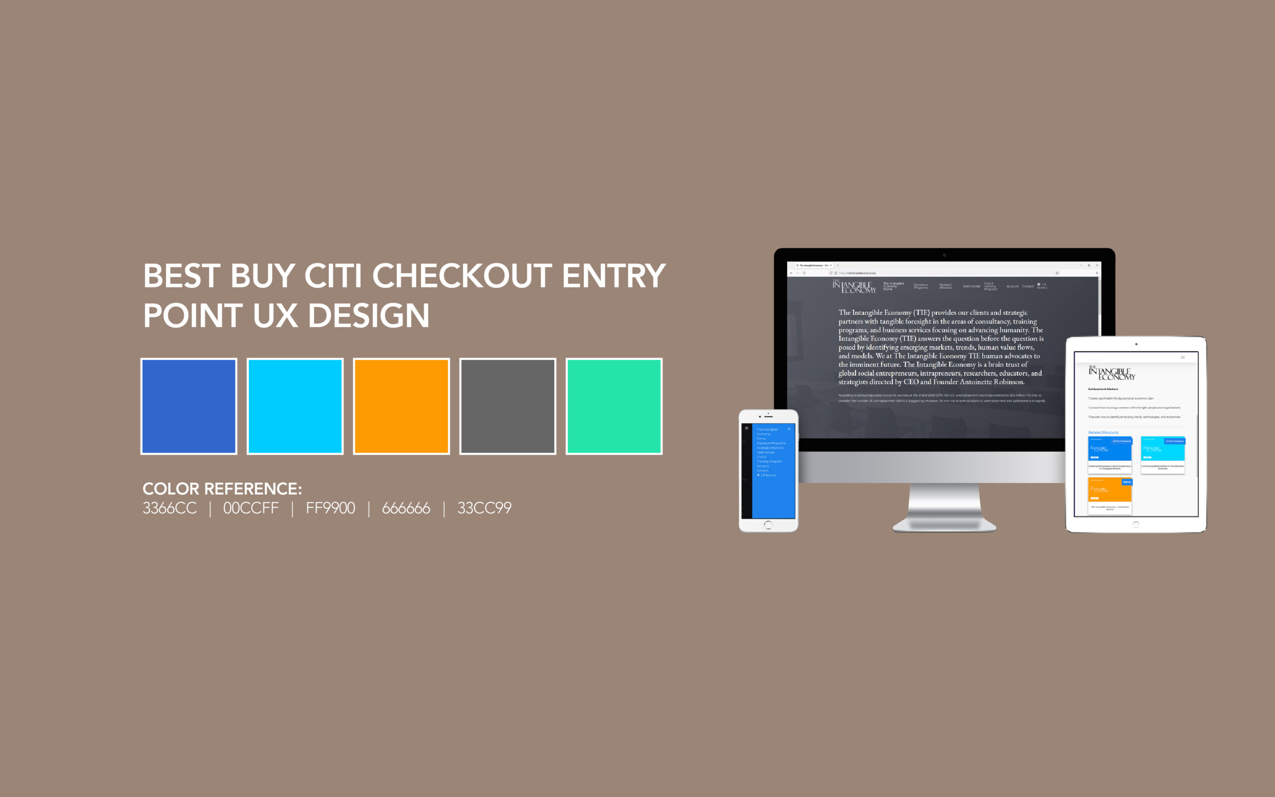
PROJECT SUMMARY

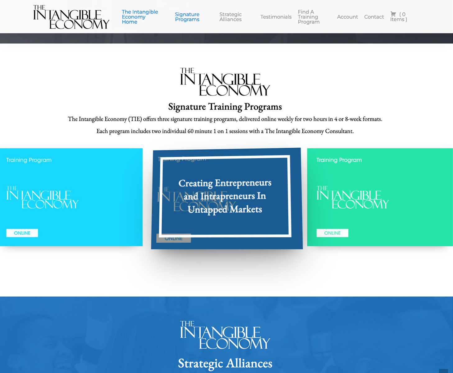
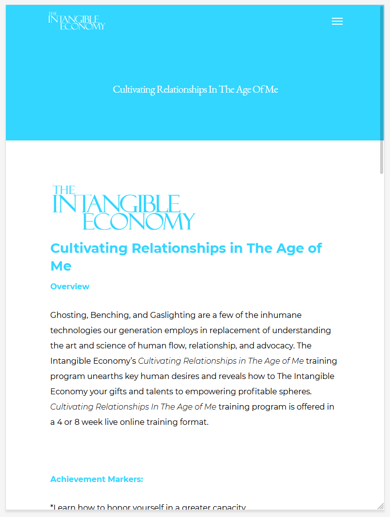
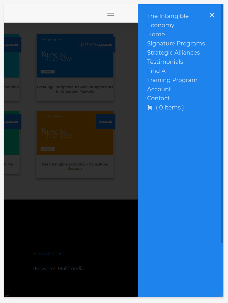
The Intangible Economy is a startup boutique firm specializing in business consultancy, personal and professional training programs, and services. This project seeks to design and implement an effective, responsive web presence and selling tool that works on desktops, tablets, and phones. In addition, this website needs to provide key engagement metrics and pass the threshold for obtaining the companies trademark.

PROJECT CHALLENGES

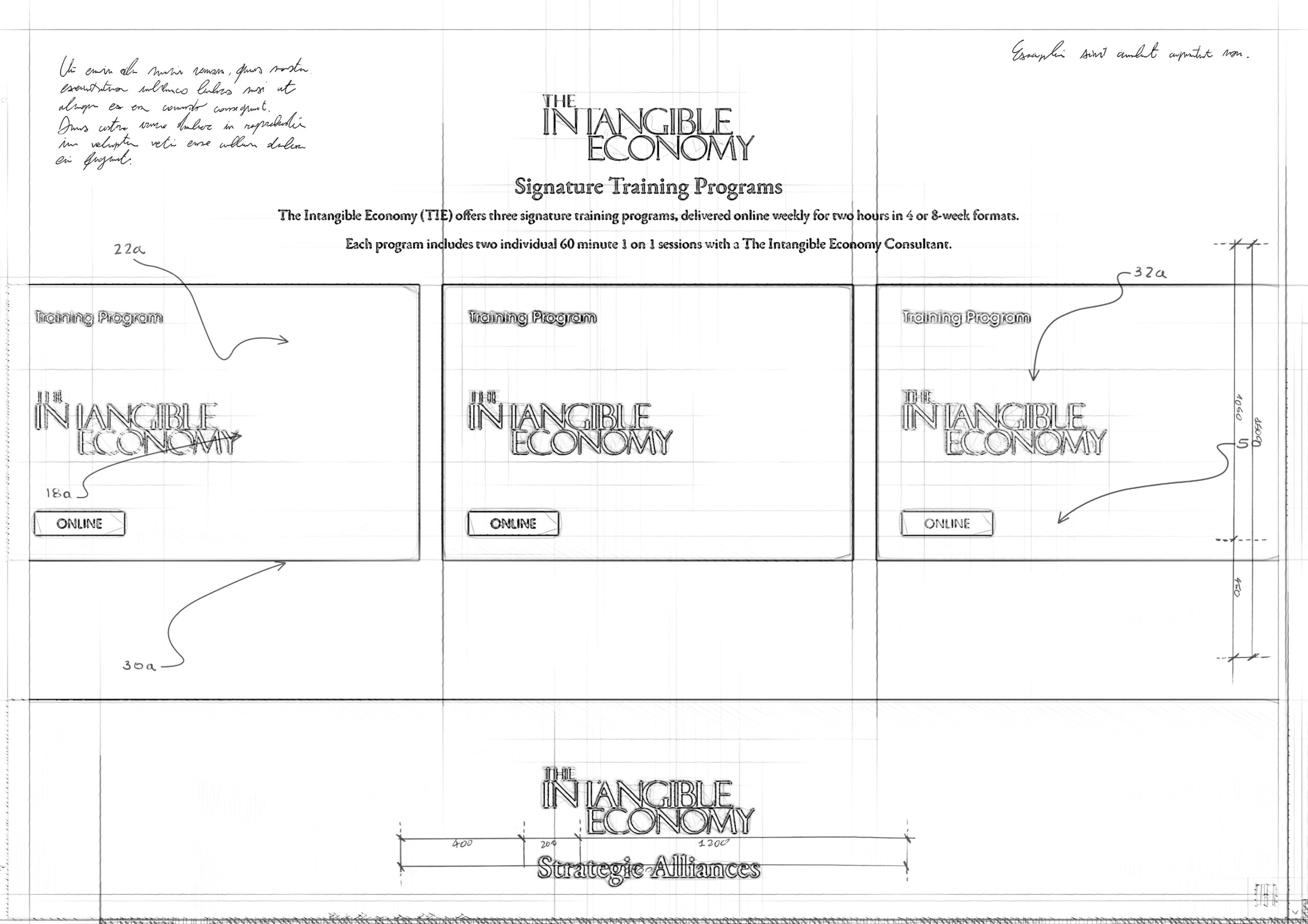
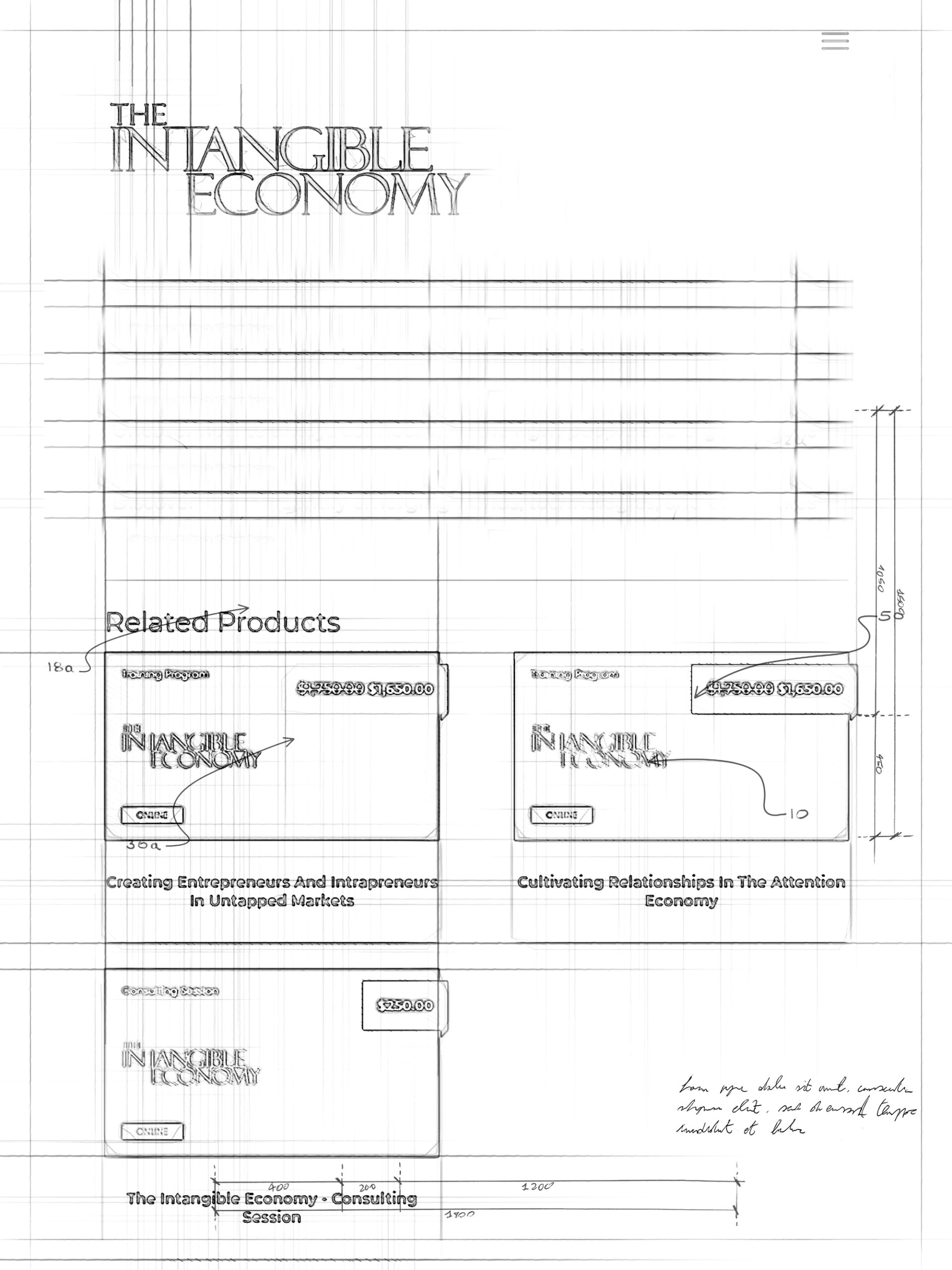
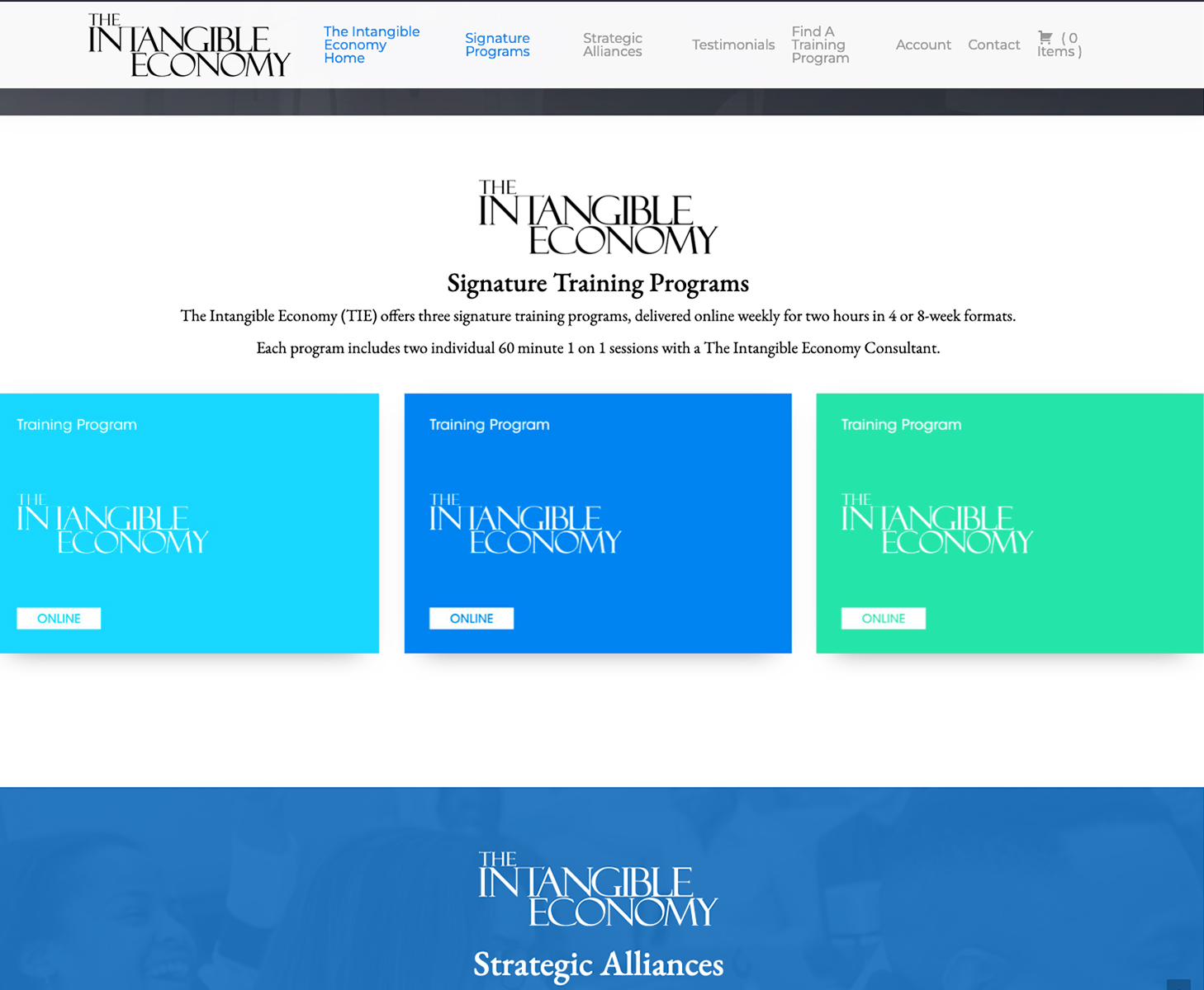
Since this was a blank canvas website design, my task was to ensure that the site’s initial structure utilized key metrics and responsive front and back end design. In addition, I was tasked with making sure that the areas of the site that displayed the different course offerings were distinguishable on site. One of the main challenges was that the clients’ offerings were not currently sold online, so there was a need for an eCommerce component of the site as well as an eCommerce app. Since this particular client had little experience with the technical aspects of web development, they leaned heavily on me to provide an initial direction and comprehensive design solution for the site. Another of the challenges of this project was the trademark aspect of this site design. Since they were getting a trademark, the site and its design elements needed to comply with that process.

THE SOLUTION

This project was a comprehensive one. The site’s trademark requirements were my first points of emphasis. Once I determined the parameters for the trademark application and what needed to be present on the site to comply with it, I began creating the wireframes. Since this is a responsive site, I created wireframes and prototypes for desktop, tablet, and phone versions.

TIE MAIN WIREFRAME
Low Fidelity (Hand Drawn) Desktop Wireframe
TIE IPAD WIREFRAMES
Low Fidelity (Hand Drawn) Tablet Wireframe

The client faced a pending trademark constraint that required them to divide the website into two different versions/phases. This decision ensured that the client was legally compliant and could continue to use their trademarked materials without any trademark issues. As a result, the first version of the site was created before trademark finalization, and the second version was developed post-trademark approval.

I used a color-coded strategy for the design to distinguish between the different program offerings. This decision proved to be effective in setting the programs apart from each other. In addition, using different colors helped the brand to create a visual representation of each program, making it easier for customers to identify the various offerings on the website. This decision also allowed the literary collateral to coincide with the web and application presentation, giving the programs a distinct look and feel and lowering printing costs for physical collateral.

The color strategy helped in branding and allowed the product pages to have different looks per program. Each program had its own unique set of colors, which enabled the designers to customize the look and feel of each program’s product page to match its theme. In addition, this approach added an extra layer of personalization to each program, which helped create an engaging user experience for the customers.

Overall, the decision to divide the website into two versions and use a color strategy proved to be an effective way to maintain the brand’s legal compliance and distinguish between the different program offerings. Using color added an extra layer of branding and personalization, making the website more engaging for customers.

The Intangible Economy Hover Start The Intangible Economy Hover Finish
Website Wobble Hover State

Apart from the design, another critical decision was made regarding the website’s target audience. I set up personas to help identify the audience and improve Ad targeting and user click habits. As a designer, I always try to minimize refactoring efforts, so I addressed some analytic targeting concerns upfront to make the website more effective and reduce the backend lift on the developers.

To achieve this, I conducted user testing with a small group of previous clients. The user testing helped us get a loose framework for the site’s user-centered direction. In addition, we learned about our target audience’s needs, expectations, and pain points, which helped us make informed design decisions. One of the primary concerns to come out of the user testing was the complexity of information presented by some competitors and similar websites.

Based on the feedback we received from user testing, we decided to focus on the usability and layout of the site. We experimented with different prototypes to determine which design worked best for our audience. Eventually, we removed the images used on the site, scaled the user journey back, and opted for my proposed colored approach.

The colored approach gave our target audience a more engaging and visually simple experience. It also allowed us to highlight different program offerings effectively. Using different colors, we could create visual uniformity and direct users’ attention to the most critical parts of the site.

Overall, by setting up personas, conducting user testing, and prototyping, we created a website that was visually appealing and user-friendly. The decision to remove images in favor of the colored approach helped us create a more focused design that met the target audience’s needs. By putting user experience at the forefront of this design, I created a website that was aesthetically pleasing, easy to navigate, and effective.

TIE PROGRAM PAGE IPAD
Product Page

During the design phase, I recognized that the website’s navigation, program selection area, and e-commerce elements needed to be improved to enhance the user experience. I knew that navigation was a crucial part of the website’s overall design because it directly affected how users interacted with the site. Therefore, I wanted to ensure the navigation was as user-friendly as possible.

To achieve this, I used a corner hamburger navigation with an overlaid menu that slid out from the right for the mobile menu navigation. This approach allowed the menu to take up as little space as possible while providing the end user with easy navigation. This decision was based on the logical reasoning that most users are familiar with the hamburger icon and know it represents a menu. For that reason, placing it in the corner makes it easier for users to find and access it, leading to improved navigation.

Additionally, using an overlaid menu that slides out from the right on mobile devices allows users to access the menu without interrupting their browsing experience. This intuitive and straightforward design approach enhances the overall user experience by minimizing the clicks required to access the desired content. Overall, by optimizing the website’s navigation and program selection area, I created a visually appealing website that was easy to use, leading to improved user engagement and satisfaction.

Hamburger Nav IPAD
Mobile Navigation (iPad)

RESULTS

In summary, this project was executed in a phased manner, with most of the additional features and changes deferred to the second phase. Despite some design debt in the first phase, the site ultimately came together nicely, and the client was able to secure their trademark. Currently, we are working on the second phase of the design, and further updates on this project will be available on our blog. Stay tuned for metrics of success, reflections, and next steps, which will be posted after the completion of the second phase.

DRT Footer Logo