MY ROLE
Product Manager, UX Designer, Web Developer, and Digital Designer. Best practice research, project manager, user research, wireframing, prototyping, and client proposal presentation.
PROJECT SUMMARY
Kingspan determined that the current plant tour did not fully utilize the opportunity to present the brand in the best light to their clients and guest. Therefore, the Kingspan tour update sought to refine and upgrade the tour experience. One of the pain points was scheduling the plant tours, and this process was the core part of this project to create an app that could alleviate the difficulties that Kingspan had in scheduling plant tours.
PROJECT CHALLENGES
Kingspan Insulation United States as a division wanted to increase the visibility of their little know sales tool, the plant tour. This initiative centered on creating a streamlined, focused plant tour and a newly constructed plant tour app to facilitate tour scheduling, follow-through, and feedback. This project was highly multifaceted. As the project manager of the plant revamp and the UX designer for the application, there were many components under my purview.
Kingspan Insulation’s sales team traditionally had a problem keeping up with and scheduling plant tours for the Winchester, Virginia plant. The sales team would like an automated system to share with their clients and prospective tour-goers. This system needs to alert all involved parties of the tour schedule, facilitate the booking of the tours, and allow for feedback and post-tour lead generation. The corporate team would like to exponentially increase the ease of booking a plant tour, increase the number of plant tours to 20-30 a year and increase visibility and knowledge of the Kingspan brand. The Winchester plant team wants a system that will allow them to schedule team members to conduct tours, know when visitors are coming in, and track the tour participants throughout the entire process.
PROBLEM STATEMENT
Kingspan Insulation’s sales team is facing difficulty in keeping up and scheduling plant tours for the Winchester plant. Users are frustrated and disappointed with the plant tour process. There is no central reservoir of appointment data for the users to see the tour schedule and information. The overall strategy does not work for the clients, the plant staff, and the internal employees (ex., Sales Reps, Plant employees, and Corporate).
MY APPROACH
As a UX Designer, my approach to most design projects starts with the following process:
- Identify The Problem
- Research and Interview
- Set Goals
- Personas
- Sitemap and User Flows
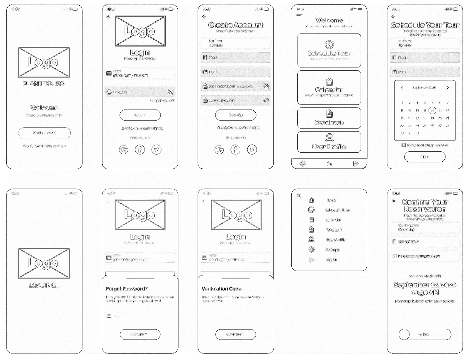
- Wireframes
- User Testing
- UX/UI Mockups
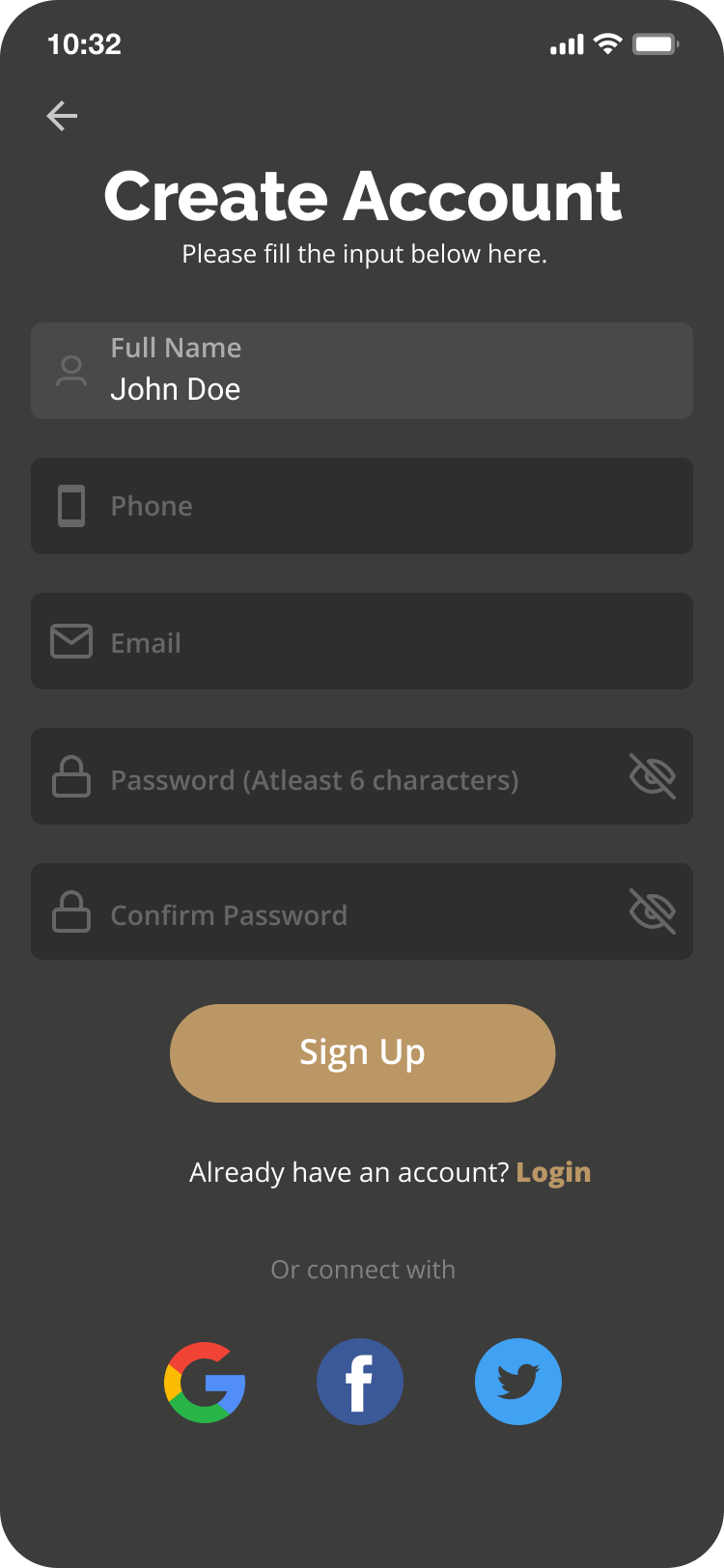
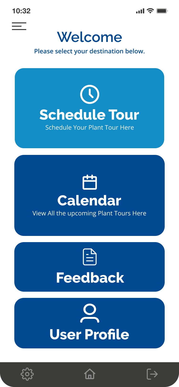
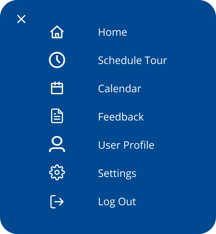
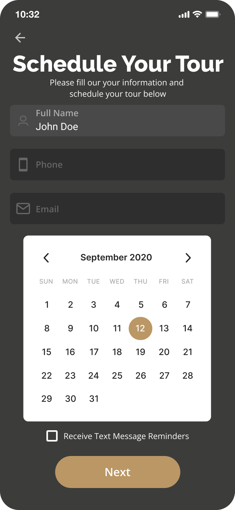
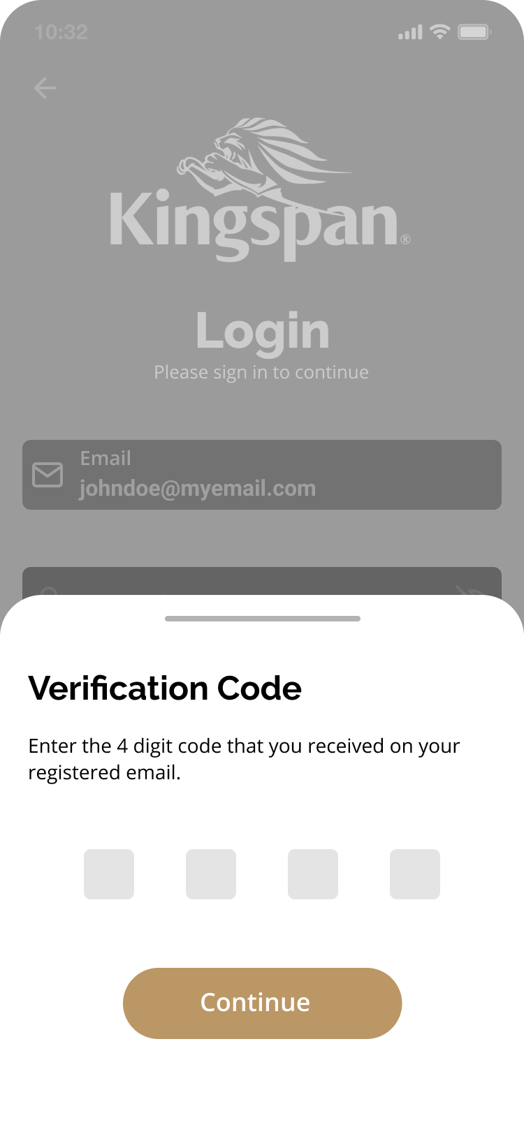
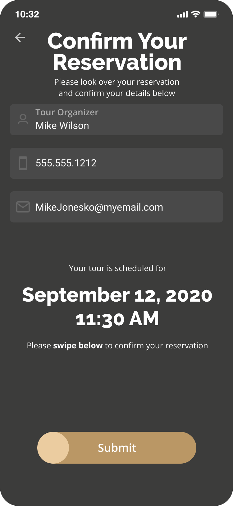
Due to the nature of this project, my approach was to break out the design for the app into three phases pre-tour, tour, and post-tour. I chose to address the pre-tour experience first. This phase includes the client experience from initial contact to arrival at the tour plant. In addition, there was a pressing demand for a company-wide shared calendar where all the employees in the plant, sales, and corporate could see the plant tours that have been scheduled.
Secondly, there was a desire for the sales team to interact with the app. They wanted to send reminders, check on statuses, and view the bookings for hotels, flights, etc. Finally, to facilitate the customization of the plant tours, I suggested setting standards and processes and different tour types; Learning, Assessment, and Teaching tour types were proposed and adopted.
Lastly, I included a few pre-tour deliverables for the app. In addition to the calendar function, I also added the following:
- Visitor & Sales email component
- Scheduling
- Welcome package scheduling
- Vendor agreement integration
- Customer database integration
- Feedback form
RESEARCH AND INTERVIEWS
Since this project would touch multiple departments and involve outside users, I decided to do some external surveys and internal and external focus groups to understand what the end-users viewed as the main goals and how they thought the app should work. I surveyed a small group of customers to get their idea of what they would want for a tour app. We also surveyed internal employees at the plant, in sales, and at the corporate headquarters to get an idea of everyone’s role in plant tours and what they wanted to see with the new app. Lastly, a steering committee was created to resolve issues beyond my jurisdiction.
The external surveys provided a means to have informal conversations with end-users. This also allowed me to gather a subset of the recipients to volunteer for testing the app. The external survey results revealed that most customers didn’t have high expectations for a plant tour. In addition, many of them didn’t know that a plant tour was an option, so there was a chance to increase visibility for the tours. This information presented an opportunity to create a tour and application that could change the client’s expectations.
Using the findings from initial external surveys, I was able to conclude the following:
- Of the users surveyed, 88% were Apple iPhone users vs. 12% Android.
- There was a 6% group that was not interested in adding another app to their phone even if it was going to facilitate the ease of booking a plant tour.
- The gender makeup of the surveyed group was 87% Male & 13%, Female.
- 78% of the respondents didn’t know that Kingspan offered a plant tour.
- 23% of respondents would be interested in scheduling a plant tour.
- 32% of respondents felt the Kingspan Corporate website was difficult to navigate and frustrating to find information on; they were concerned about the useability of the app.
- The most requested feature was a scheduler with a push notification feature for the tours.
The internal feedback was detailed and presented many “wants” and “needs.” One of the consistent points was that there needed to be visibility for when the plant tours were scheduled. There were instances where someone would organize a plant tour, and because no one knew, there was no one available to give the plant tour.