MY ROLE
UX Designer, UI Designer, Web Developer, and Digital Designer. Best practice research, wireframing, prototyping, and client presentations.
PROJECT SUMMARY
This project aimed to establish a solid and effective web presence that enhanced the organization’s online visibility and creates a pathway for lead capture and userbase expansion. Furthermore, there was a need for a refined mobile application design that captured leads and facilitated communication between potential customers and the organization. The “Ready powered by ArcheMedX” app requires a user-centered approach, focusing on ease of use, intuitive navigation, and seamless integration with the website.
THE TEAM
I worked with Senior Management and the Marketing team for this project in a Senior Digital UX Designer role.
- Molly Bryant Head of Marketing
- Nicholas Malone Senior Associate
- Joel Selzer, MBA Co-Founder and Cheif Executive Officer
PROJECT CHALLENGES
This project’s primary challenge was designing and implementing an effective web presence for the client, including the client-facing application. There was also difficulty due to the organization’s lack of a designated design department. The main challenges include the absence of a clear strategy for presenting the client’s message, the need to work within the constraints of the client’s current CMS, and the requirement for an illustrated look for most of the prototypes, designs, and mockups.
As the UX/UI designer on this project, my challenge was to provide a cohesive design solution that met the client’s needs and effectively communicated their message to the target audience. I worked closely with the client to identify their goals and objectives, understand their brand and values, and develop a design strategy aligned with their goals and vision.
One of the primary challenges I faced was working within the client’s current CMS constraints. However, this constraint, while limiting my options for design, offered an opportunity to find creative solutions to make the design work within the CMS framework while still achieving a practical and visually appealing web solution.
Another significant challenge will be developing a design incorporating an illustrated look for most of the designs and mockups. This look required a careful balance between illustration and other design elements to ensure the overall design is manageable and clear to the user.
There needed to be a clear strategy for presenting the client’s message, so I worked closely with the client to identify their unique selling points, value propositions, and target audience to ensure the design effectively communicated their message to the intended audience.
THE SOLUTION
From a UX design standpoint, my main challenge in this project was to create a design that would meet the client’s requirements while also aligning with the brand standards of ArcheMedX. This process involved working within guidelines for color, typography, and other visual elements to ensure a consistent look and feel across the site and app.
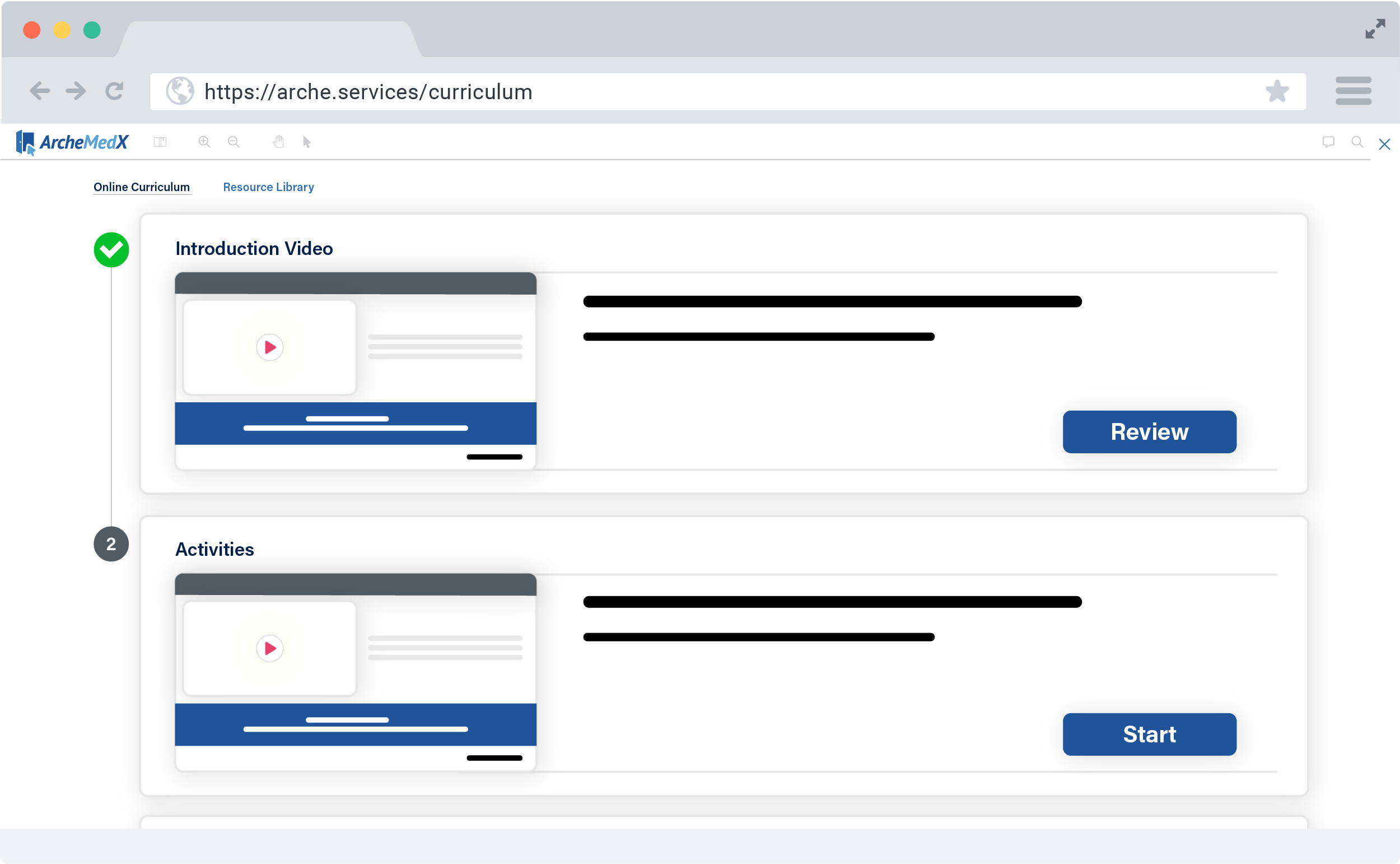
I carefully examined the information architecture and created a clear hierarchy to ensure the site was easy to navigate. This process involved creating a straightforward and intuitive navigation menu, organizing content into categories or sections, and using visual cues like icons and buttons to help users understand the purpose of different elements on the page.
Another essential consideration would be creating a responsive and adaptable design for different screen sizes and devices. With more and more users accessing websites and apps from their mobile devices, ensuring that the design solution is optimized for smaller screens and touch-based navigation is essential.
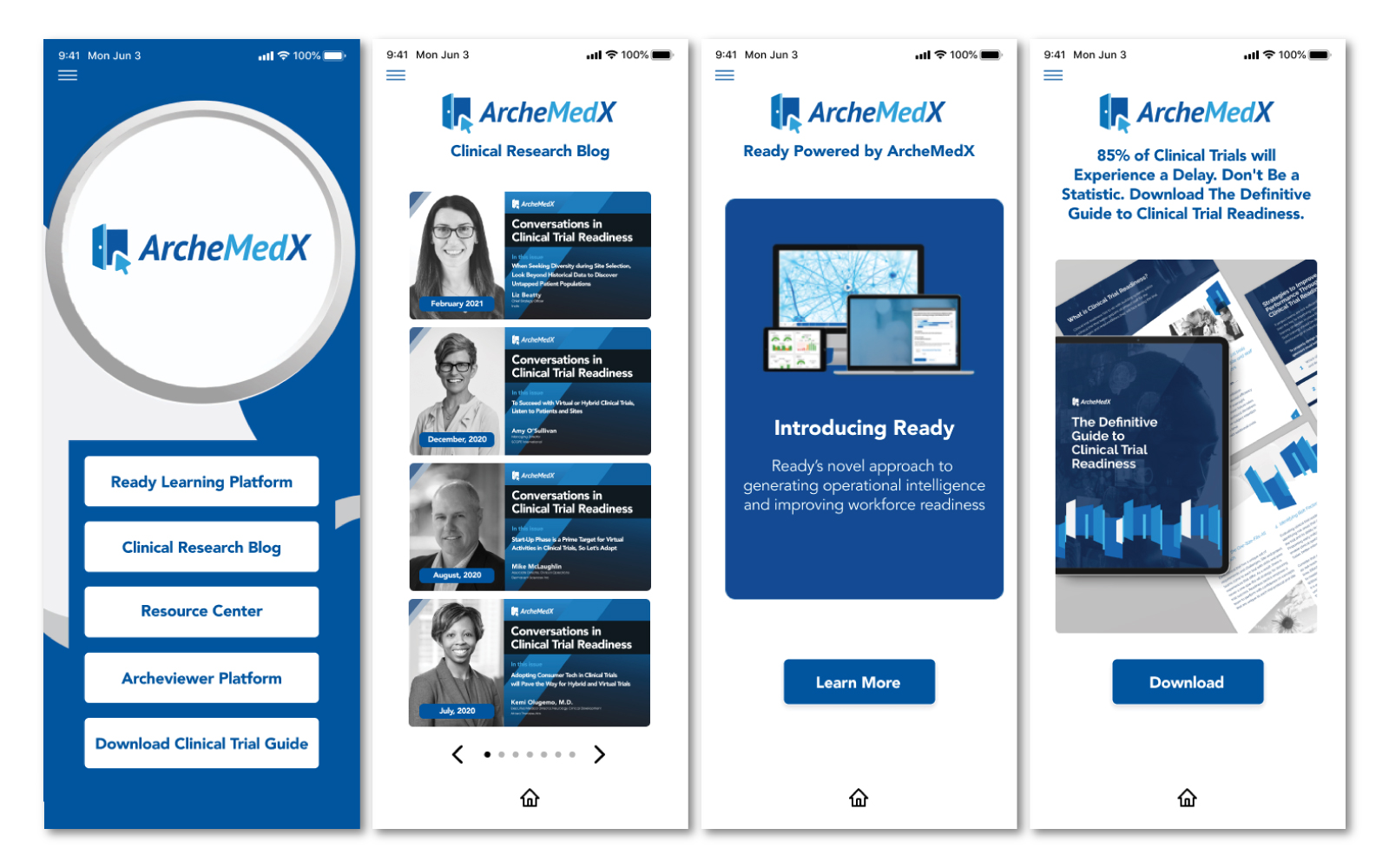
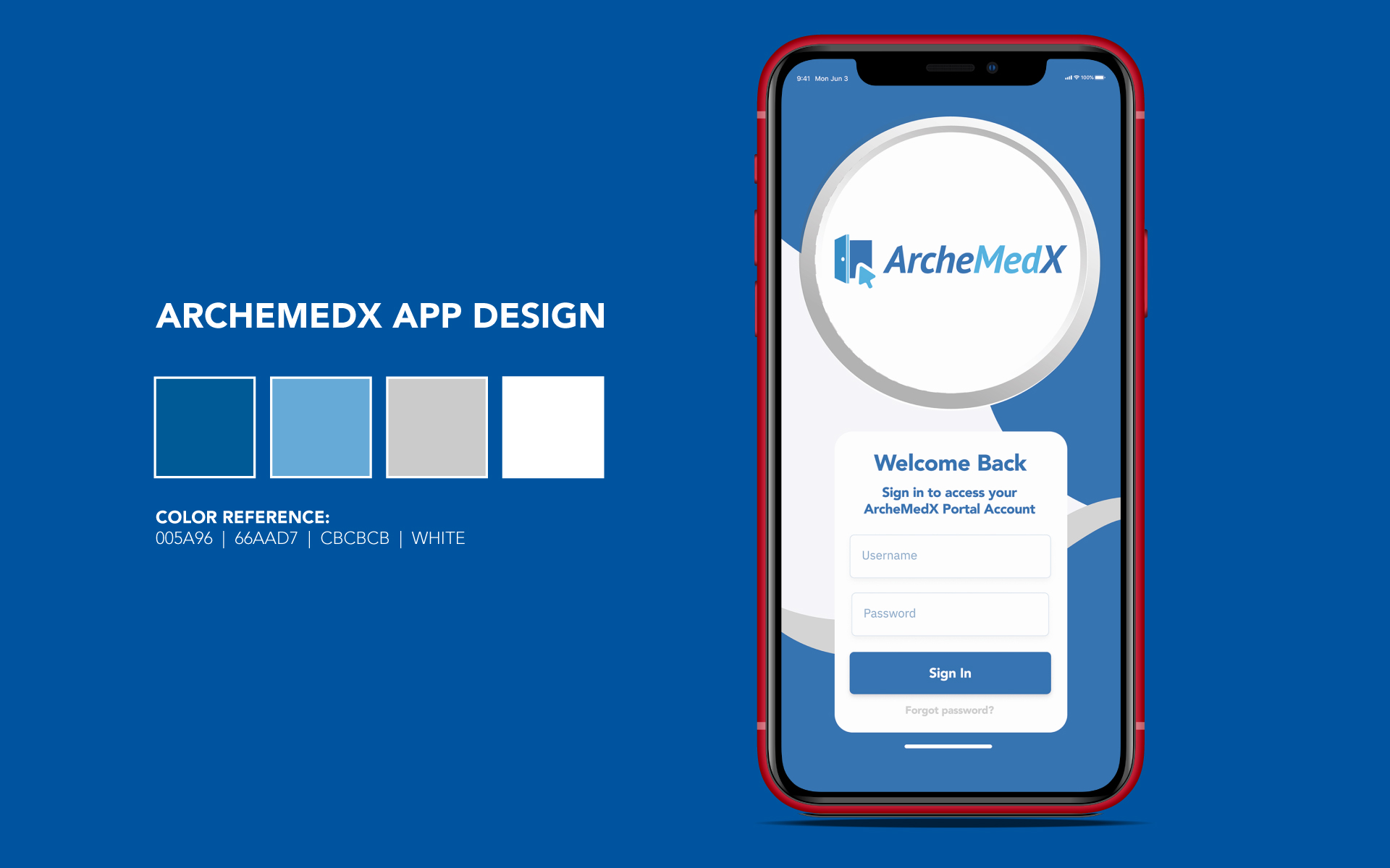
Regarding the app interface, I needed to create a simple, easy-to-use design with straightforward and intuitive controls that users could quickly learn and understand. This approach involved creating a minimalist design with clean lines and a focus on typography, using color and visual elements sparingly to avoid clutter.
Overall, the goal of the UX design for this project was to create a seamless and intuitive user experience that makes it easy for users to find the information they need and complete tasks quickly and efficiently. Achieving this required careful attention to detail, a deep understanding of user needs and behaviors, and a focus on creating a functional and aesthetically pleasing design.
INTERVIEWS
The discovery phase of this project was critical in identifying the pain points and challenges of the end users. By working with the Head of Marketing, I identified the target audience and performed user testing to understand their needs and behaviors better.
One pain point I identified was the need to promote the organization’s website and content offerings effectively. ArcheMedX services a niche market that I had to understand to know how to address this challenge. Testing results allowed me to identify a content strategy that focused on more effectively presenting the content in an easily digestible manner. This process involved conducting user research to determine the topics and formats most appealing to the audience and optimizing the site’s structure and navigation to make it easy for users to find the content they need quickly and easily.
Another pain point revealed through testing was the unpleasant user experience provided by the website. With information not easily accessible and messaging somewhat convoluted, I conducted a comprehensive redesign of the site’s user interface, focusing on creating a clean and intuitive layout that made it easy for users to find the information they sought. Through creating wireframes and prototypes, I tested different design solutions, identified a need for uniform design collateral, and worked to push the look and feel in a cohesive direction.
ArcheMedX has a loose style guide that established a consistent visual language and brand identity for the organization, but the need for a design department made its implementation porous at best. My approach involved developing a consistent color palette, typography, and graphic strategy that reflected the organization’s mission, values, and guidelines.
By identifying these pain points and developing solutions to address them, I created a more effective and engaging user experience for the target audience, driving more traffic and engagement with the organization’s content offerings.
USER JOURNEY
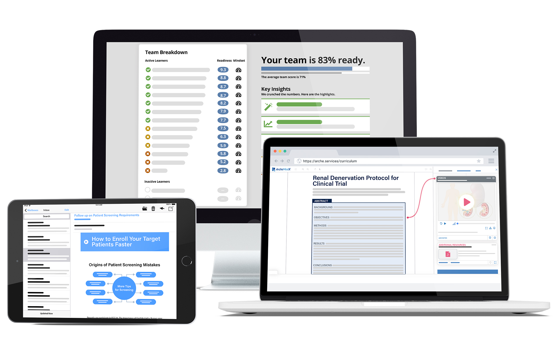
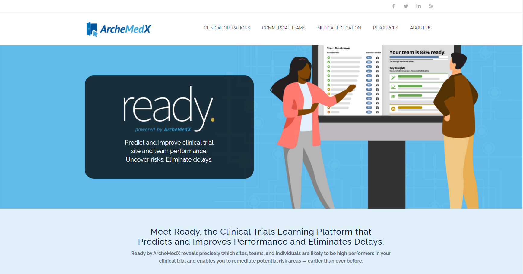
Upon analyzing ArcheMedX’s website content, I found that its status as a software company needed to be clarified. They offer a valuable product called “Ready…powered by ArcheMedX,” which provides a cutting-edge clinical trial learning platform that can predict and improve performance for teams, sites, and individuals. While this application is excellent, its messaging could benefit from an image overhaul. To better understand the ready platform and its value proposition to the end user, I created mockups focusing on core features while removing less critical details. This design project’s user journey was unconventional, but I mapped it out and utilized it to provide a design that satisfied the client’s needs.