MY ROLE
UX Designer, UI Designer, Web Developer, and Digital Designer. Best practice usability research, wireframing, prototyping, and client presentations.
PROJECT SUMMARY
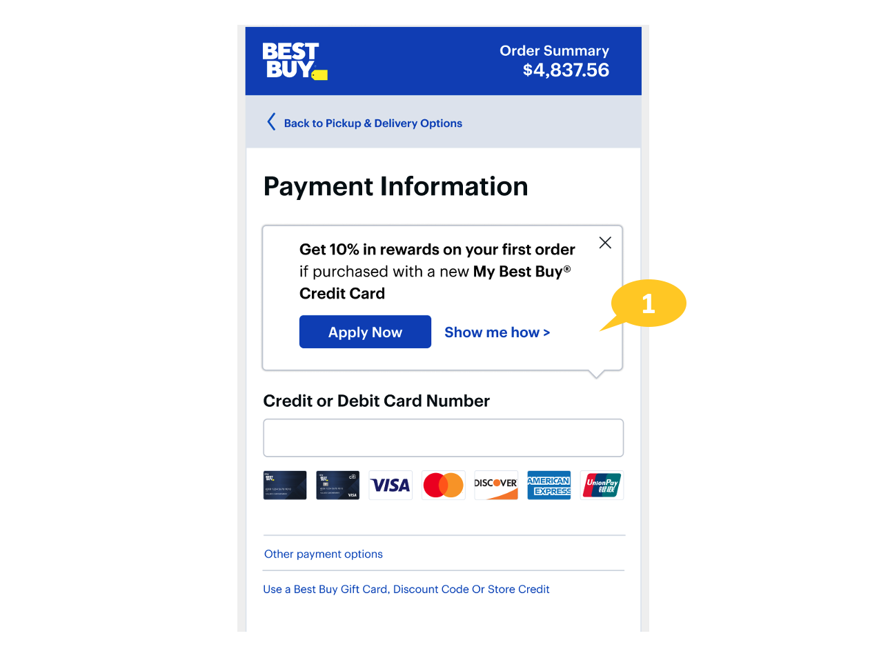
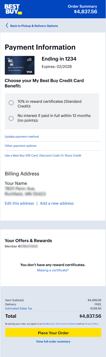
As the UX designer for this project, I created an option for customers to apply for the Best Buy credit card while at Checkout. This option currently did not exist. Customers have traditionally been shown opportunities to apply for the Best Buy Citi credit card at various points earlier in their purchase journey. Still, currently, they do not see a chance while they are on the checkout screen. By adding this option and communicating the benefits of the credit card, the hope is to increase overall credit card applications and conversions for the credit product.
THE TEAM
I worked with the Payments team for this project in a Senior Experience Designer role.
- Meghan Glass Product Manager
- Mikis Kostouros Product Manager Level 3
- Soumini Karanth D&T Associate Product Manager
- Edward Ecker UX Manager, Pricing and Payments
- Financial Services and Legal Team
PROJECT CHALLENGES
The Best Buy credit card offers various benefits, and there are a few different opportunities for the customer to apply for the Best Buy credit card in the sales journey. In addition, there was previously no option for customers to take advantage of the promotional purchase benefit that may come with the customer’s purchase and profile status. The challenge with this project was creating a credit application that presents different designs and text copy of what the customer has previously seen in their checkout journey. The application was also required to avoid unnecessarily interrupting the checkout process. It also provides the customer a way to exit this application while allowing them to reopen it if needed. Lastly, this design had a good to have requirement of doing all this with minimal development changes.
THE SOLUTION
My approach to this design was complex in need but simple in its execution and innovation due to the requirement to stay within the established Best Buy design system and all the other restrictions of working within the corporate framework. My design utilized and repurposed a previously used design element from the design system. My immediate implementation was to create an on-page load callout that could be opened and closed upon click. I used the “Info I” icon as a draw for the customer to close the initial static pop-out above the Credit and Debit card number entry point. This application allows you to Apply for the credit card directly from the checkout entry point. It also offers a click-through for the required T&Cs for the credit card offer, which is also prominently displayed in the head of the application. This approach allows the customer to see the credit card pitch one final time before entering their card information.